IoT Dashboard for Panasonic
Interaction Design
THE BRIEF
Miraie: Crafting an Intuitive Smart Home Experience for Panasonic Products
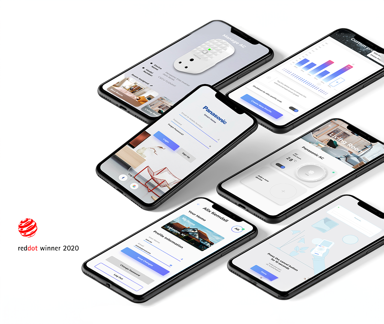
Mobile application built to provide a connected-living. This IoT ecosystem powers Panasonic ACs and other connected devices through intuitive and user-friendly app. It was designed to connect, manage and control smart devices - all within a single application.
Research
Modifying the Design Process to Achieve Success
The IoT economy in India is projected to surge to USD 15 billion by 2020, driven by increasing numbers of families embracing new technologies to enhance their lifestyles. To accommodate this change, we should to understand the needs and desires of Indian households and incorporate a design language that is familiar and suitable for them.
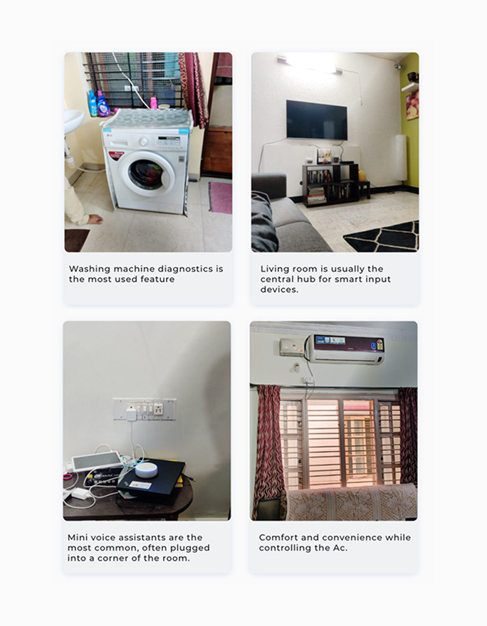
Through our research, we gained valuable insights into the Indian consumer’s environment and how they interact with physical devices. We used this knowledge to translate insights into digital widgets, creating an experience that's not just connected but also feels like second nature to users.
Our research process delved deep into the intricacies of the Indian consumer's environment, unraveling the unique ways in which they interact with physical devices. Armed with these valuable insights, we endeavoured to bridge the gap between the tangible and the digital, translating these interactions into seamless digital widgets. Our goal was clear – to craft an experience that not only echoed the familiarity of real-world interactions but also resonated intuitively with users, elevating the smart home experience to new heights.
In tailoring our design process for Panasonic's smart home ecosystem, we recognized the significance of aligning with the company's ethos. By amalgamating the structured waterfall approach with the agility demanded by Panasonic's dynamic working style, we struck a balance. The waterfall approach provided a robust foundation, enabling us to meticulously comprehend the nuanced needs of Indian households. Simultaneously, the agile methodology brought a breath of flexibility and collaboration to the forefront during the ideation and implementation phases.
This fusion of methodologies became the catalyst for innovation, propelling us toward a design process that blended precision with adaptability. This digital manifestation not only met the diverse needs of Indian households but also integrated with the requirements of the Panasonic team.
IDEATION
Identifying the User personas and features
We crafted an ecosystem that transforms passive users into empowered participants through a gradual interface. We weaved a connected experience that starts from the basics, evolves into intuition, while keeping the visual elements engaging yet light enough to run smoothly on lower-end phones at scale.
Our approach was to take the path of storytelling. We started by introducing users to basic functionalities, gradually leading them to the advanced areas of automation, sleep cycle features, troubleshooting, and data analytics. It's not just about features; it's about a journey. Our aim? To raise awareness and spark wider adoption. We didn't take shots in the dark; we meticulously mapped the first-time and repeat user journeys and crafted distinct personas to ensure frequently used actions stood out.
We crafted the user experience by tapping into what Indian consumers vibe with - they identify, trust, and then adopt new technology. Therefore, we incorporated digital interactions based on familiar physical elements to create trust and familiarity with key personas making it feel like a high-five from your favorite tech-savvy buddy. Micro-interactions conveyed expressive actions, bring big expressions, making it easy for users to switch seamlessly from object-based to digital experiences without any steep learning curve.
The core attributes that underpinned our design philosophy – connectedness, comfort, and convenience – were pivotal in shaping the overall user interaction with the product. Simultaneously, the design decisions took into account technical requirements, facilitating seamless compatibility across a wide range of devices.
The Solution
Tailoring the Scope of User Research
We customised our design process for Panasonic’s smart home experience by combining the waterfall approach for research with a more agile approach to match the Panasonic team’s working style.
The structured process of the waterfall approach helped us understand what the needs of Indian households are all about. And when it came to ideation and putting things into action, the agile approach let us be super adaptable.
This personalized approach resulted in a design process that that gave birth to an intuitive, kick-ass, and scalable connected experience, ticking off all the boxes of requirements for both the households and the Panasonic team. This layered approach to design core features was to make sure everyone gets the hang of the basic functionalities like lighting, temperature control, and security, active and passive users alike. Advanced features like automation, sleep cycle stuff, troubleshooting, and even some data analytics were added, all neatly stacked beneath the essentials for the power users.
This way of doing things led to a super user-friendly and fun connected experience for all kinds of users. It matched what Indian households were looking for, and it's flexible enough to work smoothly with various devices and technologies. To map out the features of the connected experience, we used a post-it ideation approach with the Panasonic leadership and design team.
We teamed up to sort out the features into three main categories: control, automation, and monitor. This collaborative approach allowed us to prioritize and organize the features effectively. The end result? A connected experience that perfectly matched the needs and wishes of Indian households. Through this process, we were able to create a functional and intuitive design that was adaptable to different devices and technologies.
Bringing in Familiarity
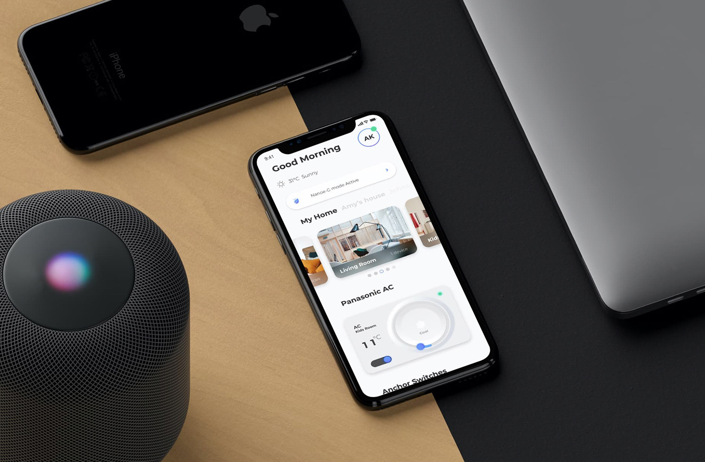
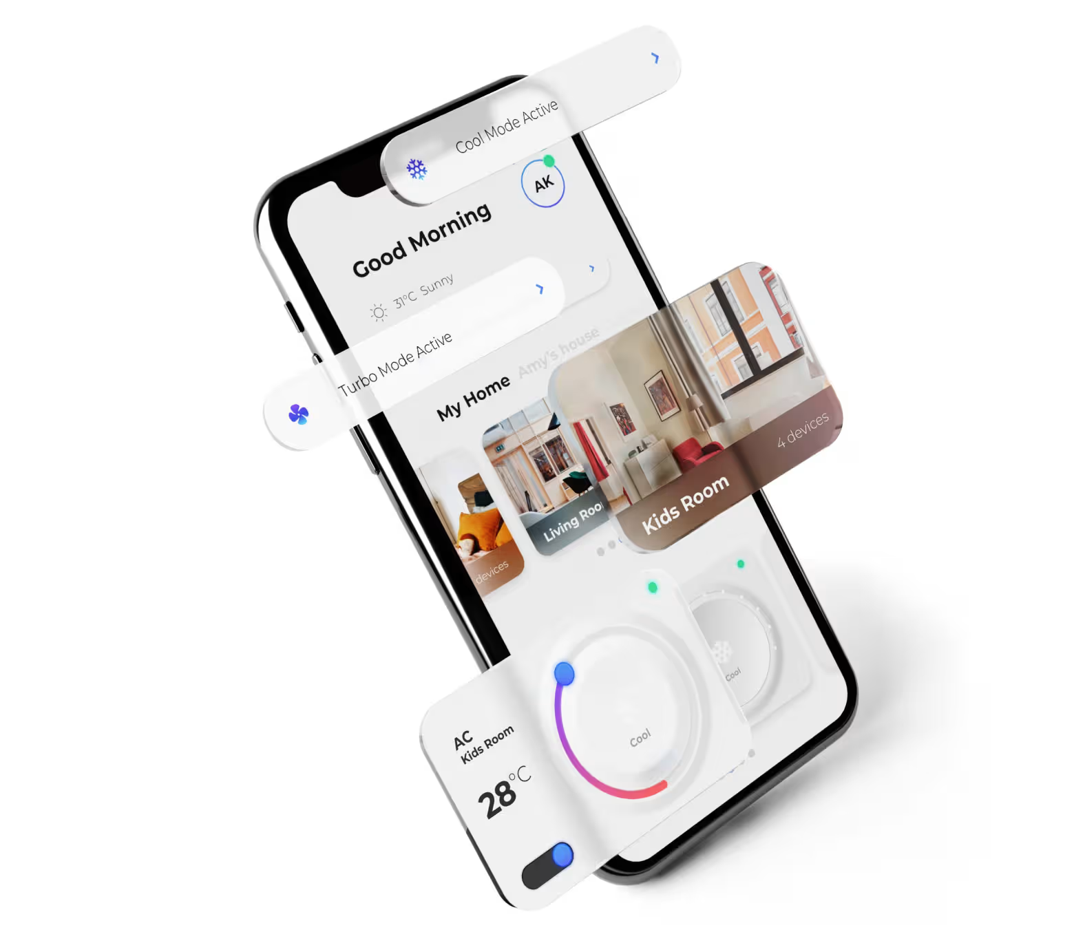
To make the connected experience more intuitive and familiar, we replicated familiar objects and controls through a subtle neo-morphic UI. For example, the lighting controls looked like a traditional switchboard and temperature controls looked like a thermostat
Familiar Objects
This deliberate design choice not only simplifies the user's interaction with the app but also transforms it into a visually engaging and highly adaptable experience. By seamlessly blending the virtual with the familiar, we've crafted a user interface that effortlessly bridges the gap between modern technology and traditional comfort, making navigation a breeze.
The Home Dashboard
The home dashboard was designed to be scalable for both small and extended families, with options and tabs for each house. We used a widget-based control and navigation system with multiple swipe gestures to stack the various smart home items. This was done to ensure that the app can grow with the user as they purchase new smart devices.
Multi Gesture Navigation
By integrating multi-gesture navigation, we empowered users to effortlessly navigate through various rooms with left or right swipes, while exploring different categories like lighting or temperature control with smooth up and down gestures.
This natural and intuitive design not only grants users enhanced control but also offers a visually reinforced experience through dynamic background color changes.
Nailing the Core Attributes
We defined the core attributes that drove the overall design philosophy and user interaction with the product. These factors were like our design compass, making sure experience was connected, comfortable, and convenient for the end users.
By focusing on these core attributes, we were able to create a connected experience that met the needs and wants of Indian households, while also meeting the technical requirements for a wide range of devices.
We added multi-gesture navigation, enabling users to swipe left or right to access different rooms and up or down for different categories of smart home items like lighting or temperature control.
This natural and intuitive approach lets users take the reins and customize things just the way they like, reinforced by visual feedback such as changing background color. It's not just about making things look good; it's about making the whole app a blast to use. This resulted in stepping up the user experience and turned it into a fun ride!
We designed nudges to act as dynamic notifications, providing users with direct access to important app functions. They were also designed to provide smart notifications based on the device status, such as maintenance alerts or notifications for applications running for too long.
This way, we made sure users stayed in the loop and connected with the app. We wanted to make setting up the device a breeze, so we went for a smooth and easy process. We threw in some visual cues and progress bars to keep in the loop and avoid any moments of confusion. This way, one can hook up your smart gadgets to the app in no time and start using them without a hitch.
Simplifying Primary Interactions
We designed each widget in the home dashboard with multiple layers of interaction, such as swipe and tap, for greater control and customisation.
A visual feedback dial that gives you a clear heads-up on what gesture you're throwing down. We tucked away the secondary interactions on the side of the widget in a smaller size, so things stay neat and simple without causing any confusion, but can still be got to them in a jiffy.
The result is a stellar user experience, where empowerment is the key note. Users are able to swiftly and efficiently connect their smart devices to the Miraie app The simplicity of the step-by-step onboarding process, coupled with the crystal-clear guidance of visual feedback, ensures users can step into the realm of connected living immediately, free from unnecessary delays or complications.
This intuitive design approach makes it a breeze for users to cruise through interact with their smart home items, making the whole process smooth and enjoyable.
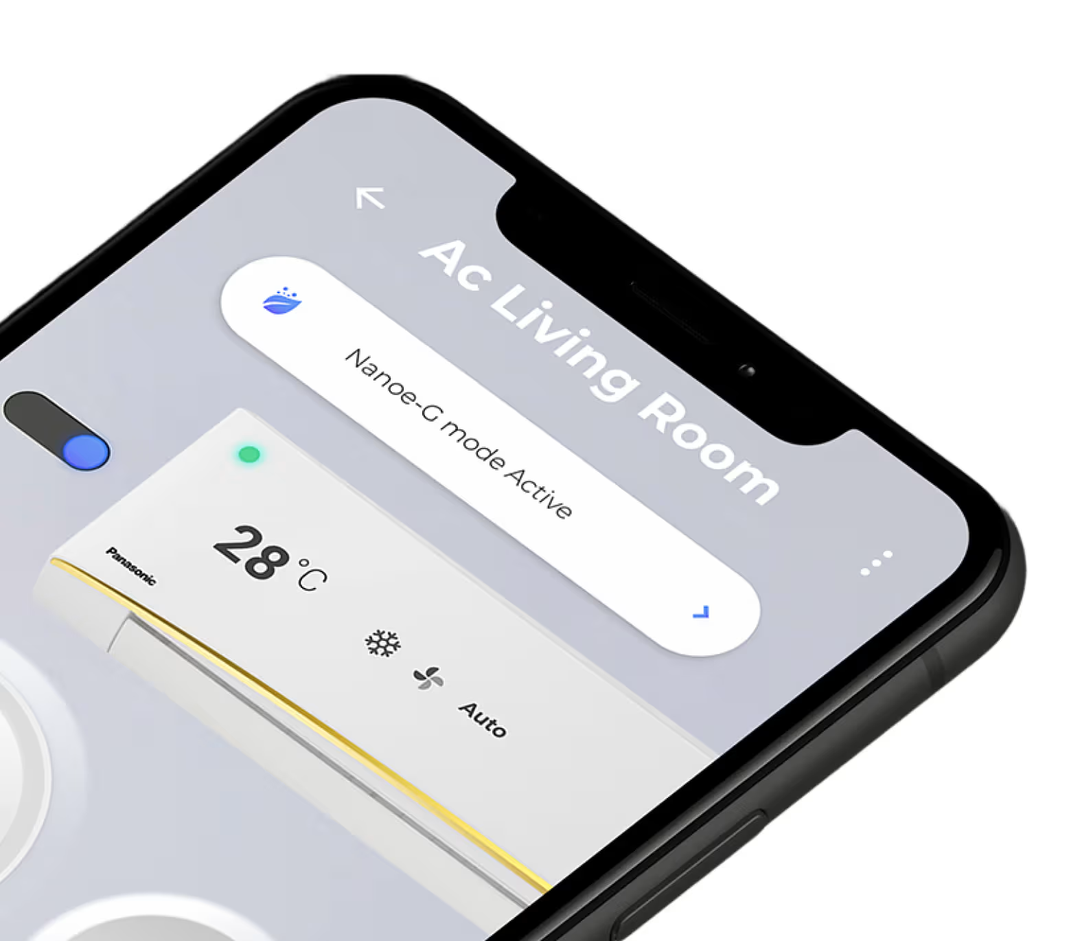
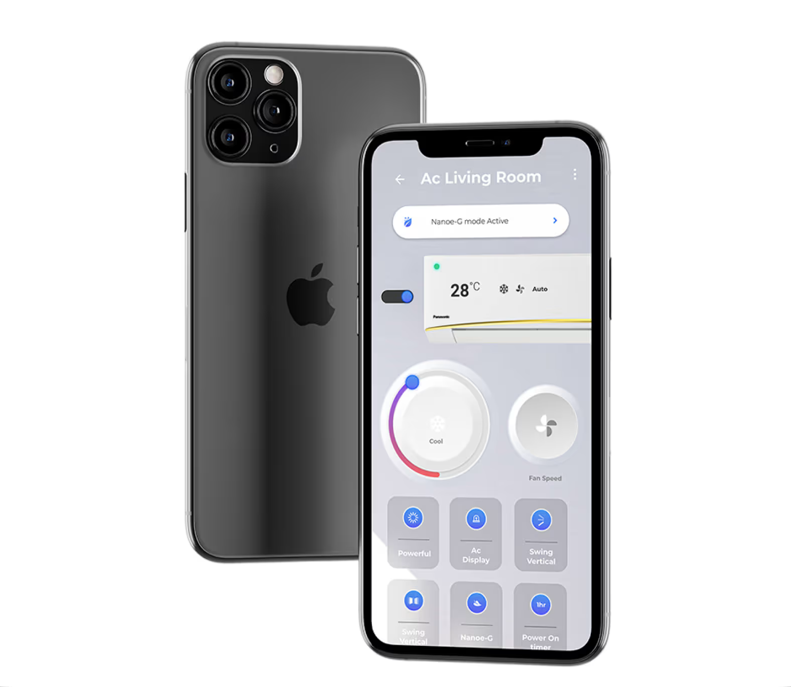
The AC dashboard was designed to provide users with easy access to the most important controls, such as temperature and fan speed. We took a realistic view of the AC system and developed the dashboard with these core principles in mind. This approach ensured that users could quickly and easily make adjustments to their AC settings, making sure the overall experience was top-notch.
Design Direction and UI Options
To explore the interactions identified during our research, our design team experimented with various design concepts, ranging from realistic neo-morphism to simplified UI.
The goal was to create a user interface that that mirrors the way Indian consumers do things in real life, all while keeping it easy to use and easy on the eyes.
During some serious UI juggling, we played around with a bunch of different designs, making sure they fit hand-in-glove with the core attributes at the heart of the experience and the overall design philosophy.
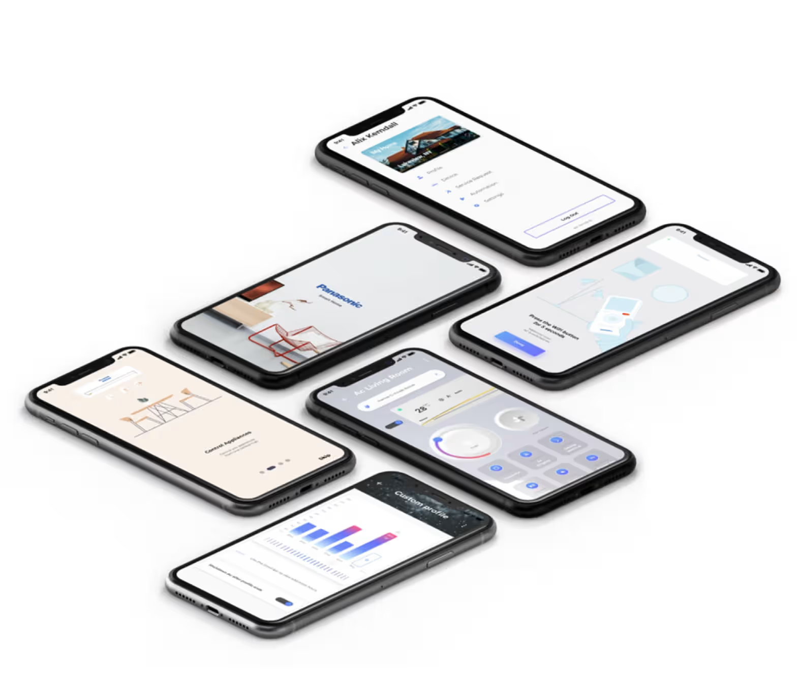
We introduced visual feedback and progress indicators, to keep users informed throughout the onboarding performance. The transparent guidance offered by these elements serves as a reassuring compass, diminishing the chances of confusion or frustration. Miraie transforms the device setup from a potential labyrinth into an intuitive dance, a choreography of connection that users navigate with unwavering confidence.
Transforming User Experiences and Elevating Brand Recognition
The Panasonic Miraie app’s intuitive and engaging user interface has successfully created a unique branding point for their range of devices. Its design approach won the app the Red Dot award and garnered significant attention on social media. The app’s user-friendly controls, visually appealing interface, and direct access to device functions have proven to be a major draw. With user feedback and regular updates, Panasonic maintains a loyal user base and attracts new customers.
Services
- Interaction design
- Style Guide
- UI/UX Design
- Product Strategy
- Prototyping
Year
2019-20
Market
US, Europe, Asia