Panasonic Miraie
Backed by

The Challenge
Designing a smart home dashboard for Panasonic that feels intuitive across devices, cultures, and usage patterns without overwhelming first time users of Panasonic. The experience had to remain familiar, scalable, and fast even on lower end smartphones.
Translating Physical Behavior Into Digital Systems
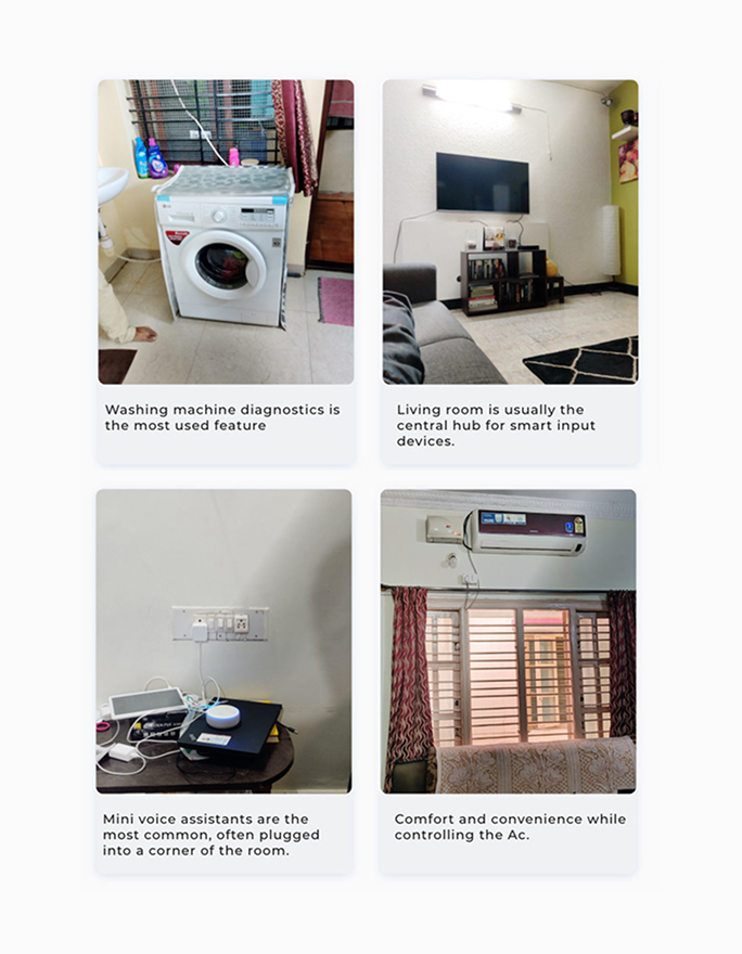
Analogy Design approached the challenge using UX research, interaction design, and system design principles. The team studied how Panasonic users interact with physical switches, thermostats, and control panels inside Indian homes. These insights shaped digital widgets, app navigation, and dashboard design that mirrored real world behavior. The result was a mobile application for Panasonic that reduced learning effort while supporting complex smart home controls.
Panasonic Miraie, conceptualized by Panasonic and executed with Analogy Design, launched in 2019 as a unified smart home app.
From isolated devices to a single connected experience that feels effortless.
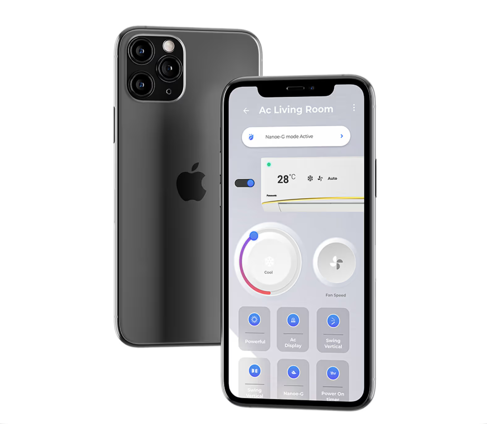
Analogy Design aligned its design process with Panasonic’s product vision and internal workflows. A hybrid of waterfall approach and agile methodology was used to balance structured research with rapid prototyping. This allowed the team to define clear user flows while staying adaptable during development. Every design decision focused on ease of use, performance, and long term scalability. The interaction design was built around familiarity and trust. Neomorphic UI elements replicated physical switches and temperature controls users already understood.Multi gesture navigation and visual feedback created confidence during daily use. This approach transformed the IoT dashboard into an intuitive digital experience rather than a technical control system.
Read similar: Designing an Inspiring WFH space for Employee Engagement
The problem
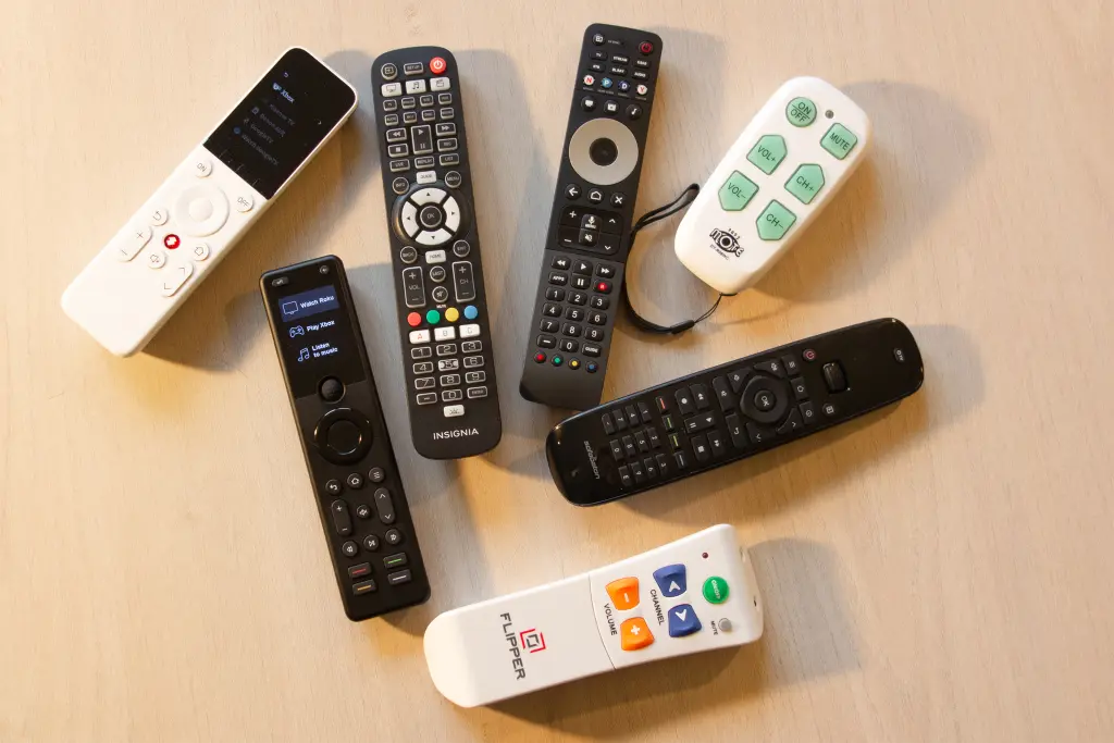
A House Full Of Remotes
Multiple control devices and remotes clutter everyday life and fragment the smart home experience. Panasonic users are forced to switch between tools for simple actions, creating friction instead of convenience.
Be guided through the whole process, from first concept through to market-ready product with success.
A House Full Of Remotes
Multiple control devices and remotes clutter everyday life and fragment the smart home experience. Panasonic users are forced to switch between tools for simple actions, creating friction instead of convenience.
Every Device Speaks A Different Language
Each Panasonic smart product comes with its own UI, navigation logic, and interaction pattern. This inconsistency breaks trust, increases learning time, and makes home automation feel complex and unreliable.

Be guided through the whole process, from first concept through to market-ready product with success.
Every Device Speaks A Different Language
Each Panasonic smart product comes with its own UI, navigation logic, and interaction pattern. This inconsistency breaks trust, increases learning time, and makes home automation feel complex and unreliable.
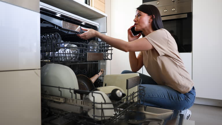
Maintenance Becomes A Mental Load
Managing updates, device status, and performance across multiple Panasonic smart systems is exhausting. What should feel intelligent instead becomes a constant source of alerts, confusion, and missed issues.
Be guided through the whole process, from first concept through to market-ready product with success.
Maintenance Becomes A Mental Load
Managing updates, device status, and performance across multiple Panasonic smart systems is exhausting. What should feel intelligent instead becomes a constant source of alerts, confusion, and missed issues.
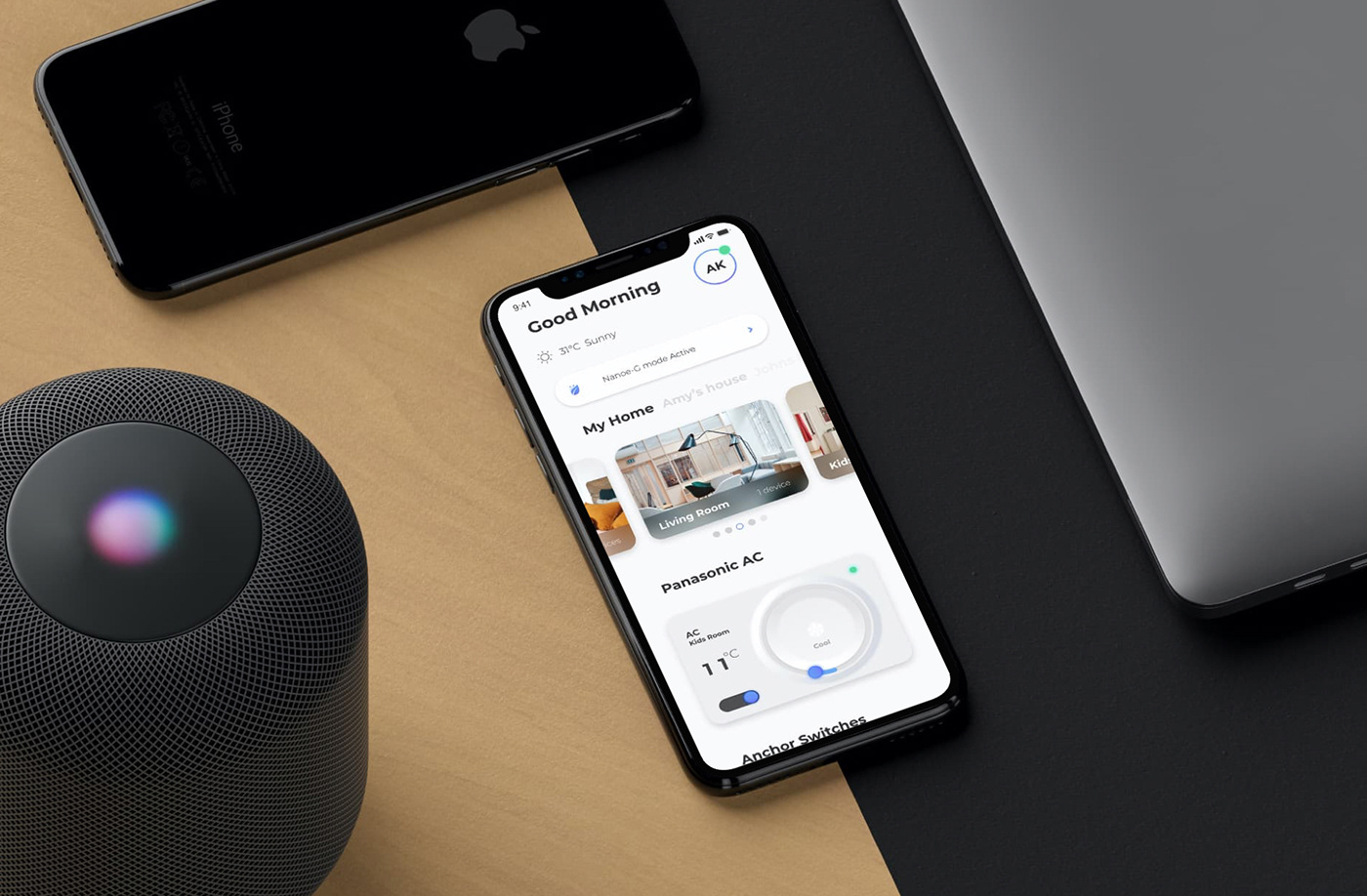
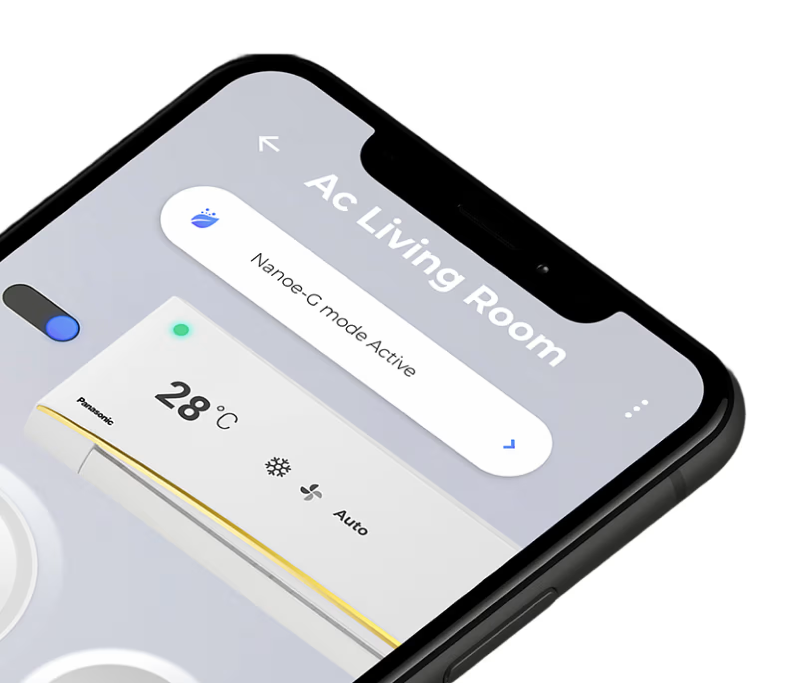
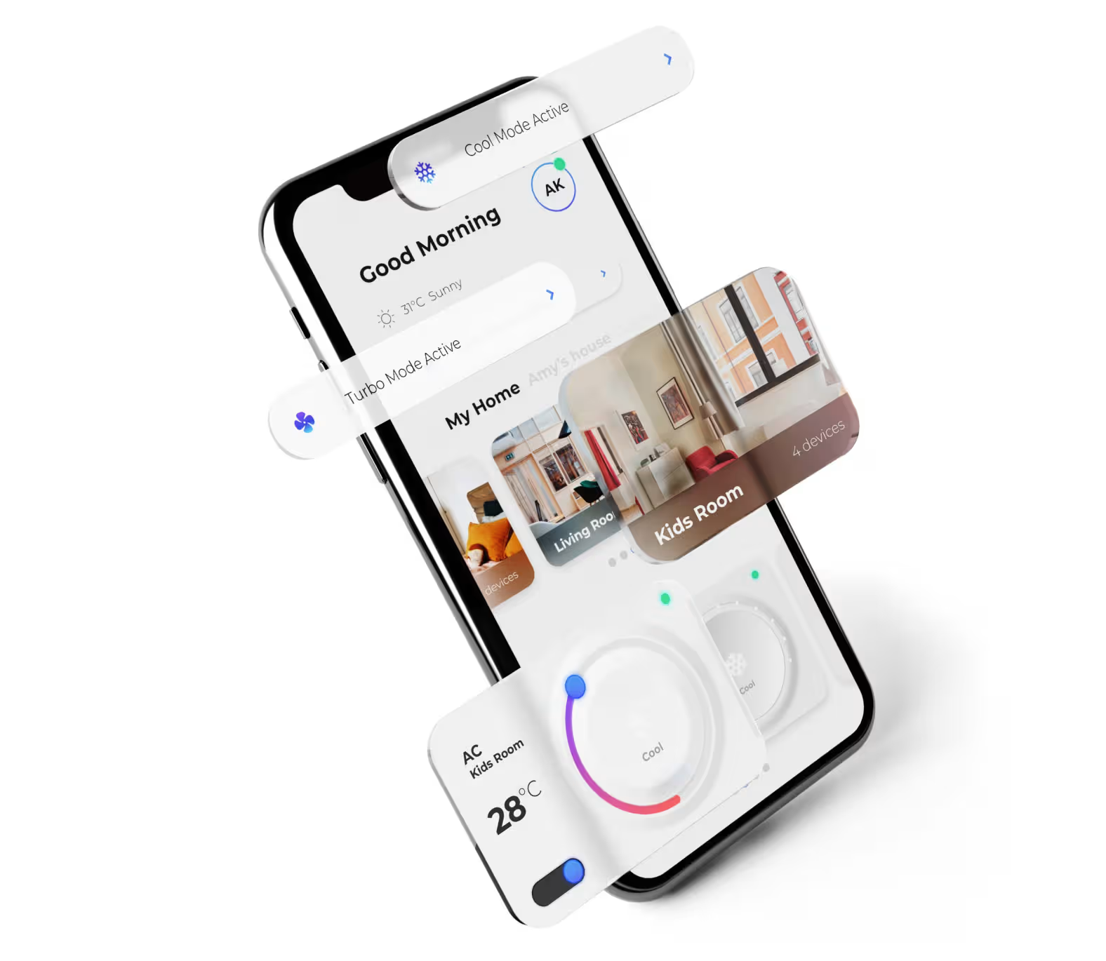
Panasonic Miraie delivers an intuitive IoT dashboard that unifies smart home controls, automation, and monitoring into one seamless digital experience.
From fragmented devices to a single intelligent system designed for clarity, control, and confidence.
Analogy Design led the UI UX design, interaction design, product strategy, and prototyping to create a cohesive smart home platform for Panasonic Miraie. The solution consolidated control, monitoring, and automation into one mobile application with a clear visual hierarchy. Familiar interaction patterns reduced cognitive load while maintaining technical depth for power users.The IoT dashboard design introduced layered access to features, keeping core controls such as temperature control and lighting control immediately accessible. Advanced automation, smart monitoring, and device management were structured beneath the primary interface. This system design ensured ease of use for first time Panasonic users while enabling intelligent automation for experienced users.
Learn more about Product Path
Key features
Anurag Shrivastava
Product Lead, Panasonic Smart devices
“Analogy brought innovation, passion, and commitment to the table, not only creating a best-in-class Smart Product experience that left our customers are mesmerized with every day, but also designing an experience that is award winning.”
Average Return on Investment Through Product Path™
250%
Average ROI
$2M
Total Funds Raised
89
Projects Funded Successfully
23+
global design awards
21
different Industries
01
Indian studio
Read more here
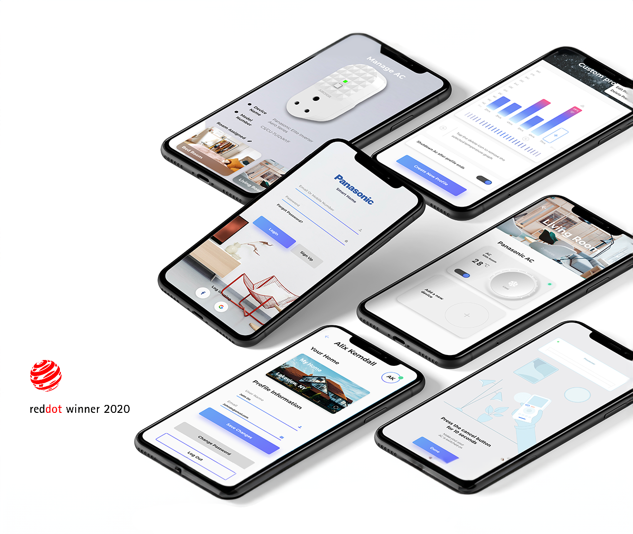
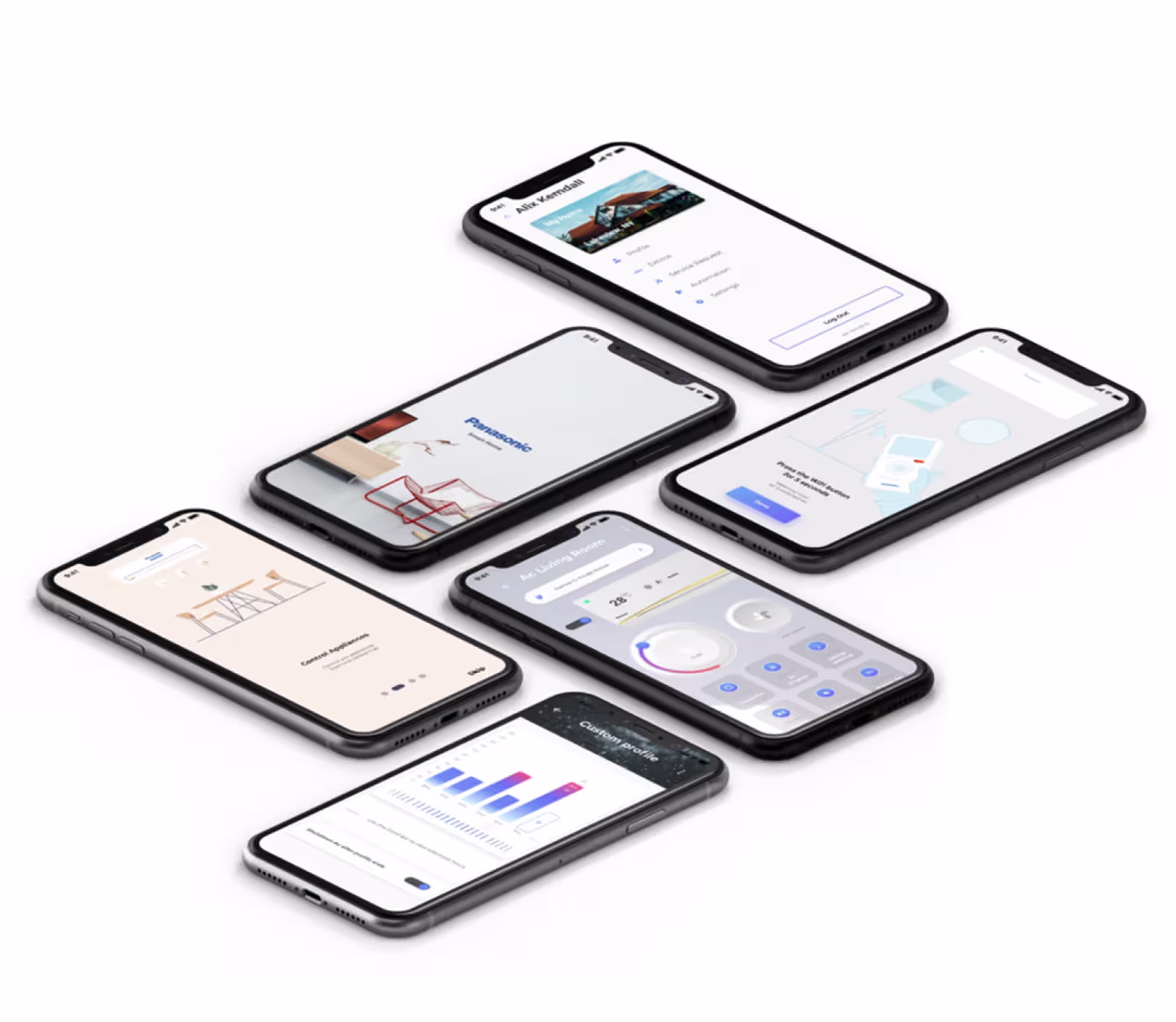
The IoT Dashboard for Panasonic Miraie was designed as a mobile application to simplify connected living for modern households. Analogy Design led the UI UX design, interaction design, and product strategy to unify multiple smart devices into one intuitive platform. Built for scale across US, Europe, and Asia, the app balances performance with ease of use on diverse devices. The dashboard enables seamless control, monitoring, and automation of Panasonic smart appliances. This design project earned the Red Dot Award 2020 for its human centered approach.
.avif)